Work through all of the open items on your to-do list to reach your goal faster: That's the basic premise of a burndown chart. This agile project management method demonstrates that agile projects are anything but unstructured. A burndown chart helps teams keep track of their tasks and remaining work, but that's not all.
In this article, we'll discuss what a burndown chart is, demonstrate how it works in practice, and let you know what to pay attention to when you create one.


Burndown Chart: Definition
A burndown chart (or diagram) shows how much work on a particular project has been completed, and how much remains to be done. For this reason, the chart also reveals the amount of work a team has invested in a project since it began.
Teams use this kind of visualization to determine if planned work can be completed in the remaining amount of time. Scrum, an agile framework, recommends burndown charts as a way to monitor a team's progress toward its goals.
There are two kinds of burndown charts:
Sprint Burndown Chart
Whenever someone refers to a burndown chart, they typically mean a Sprint burndown chart (or release burndown chart). Developers and teams use these to visualize work and tasks within a Sprint.
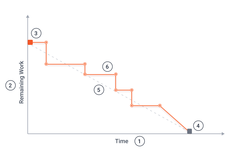
An example of a burndown chart.
The following information can be read from the burndown chart above:
- 1.
Time: The Sprint's progress is visible along the x-axis. This is measured in days and reflects the Sprint's duration.
- 2.
Remaining work: The amount of remaining work can be found on the y-axis. It can be displayed in man-days, work hours, or story points and reflects how much the team has left to do. Story points measure the amount of development work a team needs, for example in Scrum. These estimates assess the complexity of a task based on the Fibonacci sequence and relate it to a reference story.
- 3.
Sprint start: The red square signifies the first day of the Sprint and reflects the maximum amount of work to be completed during the Sprint.
- 4.
Sprint end: This point (a grey box) indicates the Sprint's end. The Sprint's end is also the moment at which there is no remaining work.
- 5.
Ideal tasks remaining: This line (dotted above) reflects an ideal progression of the team's work. The number of tasks gradually and evenly decreases. In practice, however, this sort of line is rarely seen.
- 6.
Actual tasks remaining: The actual progression can be seen above with the orange line. This can resemble steps or be more gradual, both of which we'll discuss below. Any viewer should be able to clearly see how much work is left at a particular point in time.
Epic Burndown Chart
An epic burndown chart (or report) indicates a team's progress in terms of so-called epics. In agile project management, an epic is a project requirement that's too large to be completed in a single Sprint. For this reason, epics are broken down into multiple, smaller user stories, which are completed across multiple Sprints.
These kinds of charts quickly show a team's progress on an epic, which of its tasks still need to be completed, and which remain to be done. It's also possible to predict when the team will likely complete an epic. This diagram is specifically geared towards agile teams that work with Sprints and shows the epics over their course.
An epic burndown chart is a very specific visualization. For the rest of the article, we'll discuss a 'standard' Sprint burndown chart.
Burndown Charts in Practice
Teams use burndown charts to gain an overview of all remaining work and to determine how it should be completed. Through daily updates, all team members are kept on the same page.
Possible Uses
A burndown chart can be used in any Agile project, however, it's most commonly paired with Scrum. The chart can reflect periods of time, indicate milestones, and visualize remaining work. Intervals of time different than those found in Scrum can also be displayed, however, burndown charts are rarely used for long-term planning.
In addition to Sprints and epics, it's possible to visualize a product backlog with a burndown chart.
Because of its transparency, burndown charts are a great visual aid to help direct and manage a Sprint. With them, it becomes possible to recognize early on whether a team can reach its Sprint goals, or if there are any obstacles that first need to be overcome.
The chart also offers insight into a team's level of productivity. For example, viewers can see whether a team is overburdened or able to take on more work, and how quickly it can complete any assigned project or task. This is known as velocity and measures the amount of work that a team can complete within a Sprint and its relative speed.
For the team to be able to benefit from all of the above, a few conditions must be met.
Usage Requirements
To create a burndown chart, you'll need some information about the project, such as its progress. Once you have this, you'll want to pay attention to these factors:
The team must agree on what the chart means
Team members need to regularly update the chart, so that it remains accurate and useful
Backlog tasks must be estimable; if epics are already divided into user stories, these need to be further broken down into smaller tasks.
Remaining work must be revised on a daily basis; efforts up to that point do not play any role
Once you're able to meet these requirements and stick to them, you're ready to efficiently use burndown chart.
Guide: Make a Burndown Chart in 5 Steps
There are many Microsoft Excel templates for burndown charts, along with a range of other project management tools that can help create them.
Regardless of what method you use, we recommend the following steps:
Step: Specify the Period of Time
Scrum Sprints have a fixed length. If you'd like to use a burndown chart for a project, start by determining what sort of timeframe it should occur in. When will the project or Sprint end, or asked differently: By when should the team have completed all of its assigned tasks?
Step: Estimate User Stories
Next, you'll want to estimate the work and effort needed for user stories in story points, working hours, or days. This will be plotted on the chart's y-axis and represents a Sprint's total amount of work. User stories that are too big to estimate, must be broken down into smaller, more easy to evaluate tasks.
Step: Set a Sprint Goal
It's now time to specify a goal or target for your Sprint. How many stories should the team handle? These, in turn, indicate the starting amount of work for the Sprint. You can use team velocity here since it reflects a team's relative level of efficiency.
In the event that you don't know your team's velocity, ask them how much work they're able to handle so that they'll be neither overburdened nor left with too little to do.
Step: Transfer the Data to a System or Template
To bring the burndown chart to life, you'll need to fill it with the data you've collected over the previous three steps as well as the guidelines your team has established. With Microsoft Excel templates, you'll need to manually input figures, however, there are a number of tools that entirely automate and greatly simplify this step.
For example, if your backlog and stories are already managed with Jira, you can assign specific stories to a Sprint. This helps you to see how many story points there are, as well as the ability to adjust your Sprint planning so that it corresponds to your Sprint's goal or target.
Step: Monitor and Update the Chart
Once the necessary data and stories have been input, all that's left to do is perform daily maintenance of the chart. All developers are responsible for any tasks that they've been assigned. At the end of each day, they should determine how much work the story still requires. Only in this way, can the burndown chart remain accurate and current.
The system will automatically visualize all of the data you've supplied, and allow it to be interpreted.
Interpret a Burndown Chart
As mentioned above, a burndown chart can take different forms and represent a wide range of information. Below, we'll introduce you to some of the most common ways to interpret this data.
Stairs and Stagnation
At the outset of this article, we provided an example of a burndown chart. On it, 2/3 of the actual tasks remaining line looked like steps on a stairwell. So what does this mean?
One explanation might be that the chart was not updated as often as it should have been. Some teams only update their burndown charts every few days, which creates periods of stagnation (no change) and relatively intensive work (dramatic change). This pattern repeats itself until no tasks are remaining. As a result, the actual tasks remaining line isn't as smooth or gradual as that for ideal tasks remaining.
Of course, there can also be delays or obstacles that cause work not to progress, however, most of the time, irregular updates are the root cause. In the event that stagnation is visible even with regular updates, you'll want to take immediate action and find the source of the problem. Otherwise, you might miss your Sprint's goal.
Stark Contrast Between the Ideal and Actual Lines
The actual tasks remaining line's curve can sharply extend both above and below the ideal tasks remaining line. There are several different reasons for this.
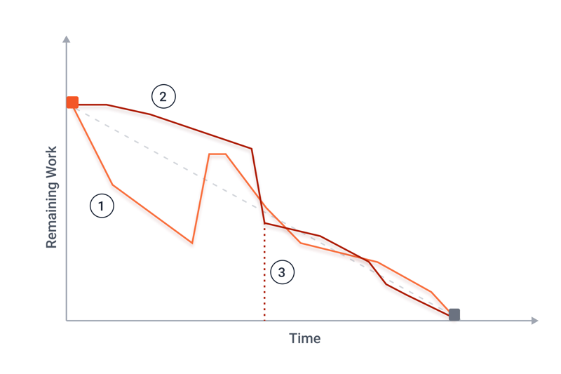
The lines above provide considerable insight into the corresponding project's progress.
Curve 1: New tasks
The team completes tasks ahead of schedule with the actual tasks remaining line dropping below that of the ideal tasks remaining line. This might indicate that the team was given too little work, or that one of the stories was over-estimated in terms of complexity. As a result, new tasks are added to the Sprint, and the curve normalizes. Scrum teams should not be given new tasks during an ongoing Sprint, however, this does happen in practice.
Curve 2: Fewer tasks
Things are a bit different for Curve 2: Progress doesn't stagnate, however, it's hard to see. Either the team underestimated its stories or they're overburdened. With the removal of some tasks from the Sprint, the curve is normalized and comes closer to the ideal tasks remaining line.
Curve 3: Sprint discontinuation
For the problem identified in Curve 2, there was another trajectory: Curve 3 shows what happens when a team abandons a Sprint without a reduction in workload.
Usage Tips
Now that you're able to make and interpret a burndown chart, we'd like to provide you with a few tips.
Use burndown charts to track progress and effectively communicate it with organizational managers. Do not use it as a lever to boost the team's performance.
Display the chart publicly, so that everyone can see it. In this way, it'll also serve as a motivational tool.
Make sure that all team members regularly update the burndown chart, to keep it relevant and insightful.
Compare burndown charts from multiple teams with one another. This can be fun and even introduce some (healthy) competition into your organization. Teams can also learn from and support each other's further development.
Advantages and Disadvantages
As with just about everything, there are advantages and disadvantages to burndown charts:
Advantages
Easy to understand
Provides a clear overview of remaining work in a Sprint
Ideal tasks line shows whether the team is on schedule
Visual tool that offers a quick glimpse into a Sprint's current status
Possible to accurately forecast when work will be completed
Helps to easily gauge team productivity
Excellent stakeholder communication tool
Disadvantages
The ideal line assumes that a team works with the same amount of resources on a particular task, however, this is rarely the case in practice
Only an approximation and not entirely accurate since values depend on the team's estimates
Curves need to be interpreted
Only a specific part of a project is displayed
Effective use requires well-defined tasks that can be realistically estimated and forecast in terms of workload
Alternatives
There are many other charts that serve as monitoring tools, several of which we'll introduce below:
Burnup Chart
A burnup chart doesn't indicate the remaining amount of work, but rather, the work the team has already completed. As such, a burnup chart's curve goes in the opposite direction (i.e. from bottom to top) as the amount of completed work increases (rather than decreases) over time.
Another difference with a burndown chart is that changes in scope are easier to integrate with a burnup chart. However, these can be used together, or as a substitute for one another, depending on what sort of information the team wants to be able to read.
Cumulative Flow Diagram
Should the information reflected in your burndown chart not be enough, you can create a cumulative flow diagram. Its curve is similar to a burnup chart, however, multiple curves are displayed at the same time.
Use it to visualize backlog tasks, as well as those that are in the realization stage, undergoing testing, or already finished. Just keep in mind that the more curves you'd like to display, the more complex the diagram will be.
Conclusion
A burndown chart helps to manage Agile projects and view the remaining amount of work in relation to a specific period of time. This provides an answer to the question of how many tasks the team has "burned down" by a certain date. But that's not all a burndown chart reveals.
It also indicates whether a team is overburdened, or can take on more work, and how productive it is. Teams can compare their burndown charts to one another, share experiences, and promote mutual development.
These days, there are many tools and templates that can easily and quickly create these kinds of charts. However, there are some guidelines to follow to ensure that your organization gets the most out of its burndown charts: Update them regularly (ideally at the end of every work day) to maintain relevance and accuracy.