Everything from businesses to political parties to sports teams can be easily recognized by the colors they use. Since so many aspects of life are related to color, it makes sense to carefully consider which combination of these is best for your brand or marketing campaign.
In this article, we'll shed some light on what colors mean and let you know what sort of psychological effect colors can have.
What Is Color?
For this article's purposes, colors are "perceptions of light created by the eyes and brain".
For paints and pigments, the primary colors are Red, Blue, and Yellow. At the same time, the "psychological primary colors", or those colors that our mind uses to create all other colors are Red, Blue, Yellow, and Green.
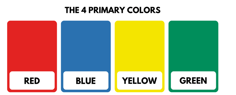
The four psychological primary colors are red, blue, yellow, and green.
The psychological primary colors are further differentiated from color models, each of which has its own set of primary colors (for example RGB or CMYK).
There are many more naturally occurring colors whose wavelengths are perceptible to the naked (human) eye. These represent varying intensities and tones of the primary colors. As an example, blue spans the spectrum of 380 nm (violet) to around 500 nm (light blue) while red's spectrum goes from orange (600 nm) to dark red (780 nm).
All cats are gray after dark
The spectrum does not include grey, white, and black. This is because these are not chromatic colors in a physical sense, but achromatic (or uncolored) colors. Put simply, white is pure light, while black is the absence of light. When a small amount of light is added to black, grey is created.
Cold, warm, light, and dark: Color temperature and contrast
A color's tone is far from the only factor in determining its appearance since the color temperature also plays a significant role. Humans have the ability to differentiate between warm and cold colors. Warm colors include red and yellow tones, while blues and greens are cold colors.
The easiest way to understand color temperature is to think of electrical lighting: Neon office lights give off "cold light", which has a high proportion of blue. Warm light, on the other hand, is emitted by candles or fires, which appear more yellow or orange. Color temperature plays a significant role in how we perceive colors as well as what meanings we attach to them.
Another aspect that's important when multiple colors are combined with one another is contrast. The simplest contrast is between light and dark. You might notice this in graphics or ads where your focus is drawn to the lightest area of the image.
Other types of color contrasts include:
Cold-warm
Complementary (usage of colors positioned across from one another on the color wheel)
Hue (interaction between adjacent colors, or hues)
Saturation (luminous-strong colors combined with less saturated ones)
Extension (combination of multiple primary colors)
Color: More than just physics
As can be seen, there's much more to color than just physics or pigments. Everyone has a favorite, they're used in idioms to describe all sorts of things, and we make dozens if not hundreds of daily associations based on them.
Beyond that, every person perceives colors differently. In the recent past, pictures have circulated across the Internet of certain objects, with people asking whether an item is purple or blue, and green or yellow. In 2015, the Internet went wild for The Dress: Are its stripes white and gold or black and blue?

White and gold or black and blue: Did you discuss this infamous dress's stripes with your friends and family? (Source: swiked.tumblr.com)
Researchers have found that our differing perceptions can be traced to how our brains process what they experience, as well as an image's lightness or darkness. Those who focus on the above image's luminosity will perceive the dress's stripes to be dark (black and blue). By contrast, when not taking the image's lightness into account, the stripes appear gold and white.
This makes it all the more important to keep in mind that the following section on color psychology is highly subjective. It's impossible to be 100% certain about whether a particular design will be perceived similarly by its target audience.
Color Psychology and Symbolism: How Colors Work
Each color is associated with certain traits, emotions, and meanings. These aren't the same for everyone, however, depending on your culture, there are certain patterns and rules, knowledge of which will benefit web designers. Below, we'll briefly review what different colors represent:
Red
Red is a powerful color. Common associations include love, blood, passion, danger, warning, sharpness, fire, energy, and hate. Teachers commonly use red to correct errors and draw attention to mistakes.
The color is not well-suited for longer texts or large areas. Highly saturated red tones with low black levels include fire red and stop sign red. As the black level increases, tones like Bordeaux red and wine red will result.
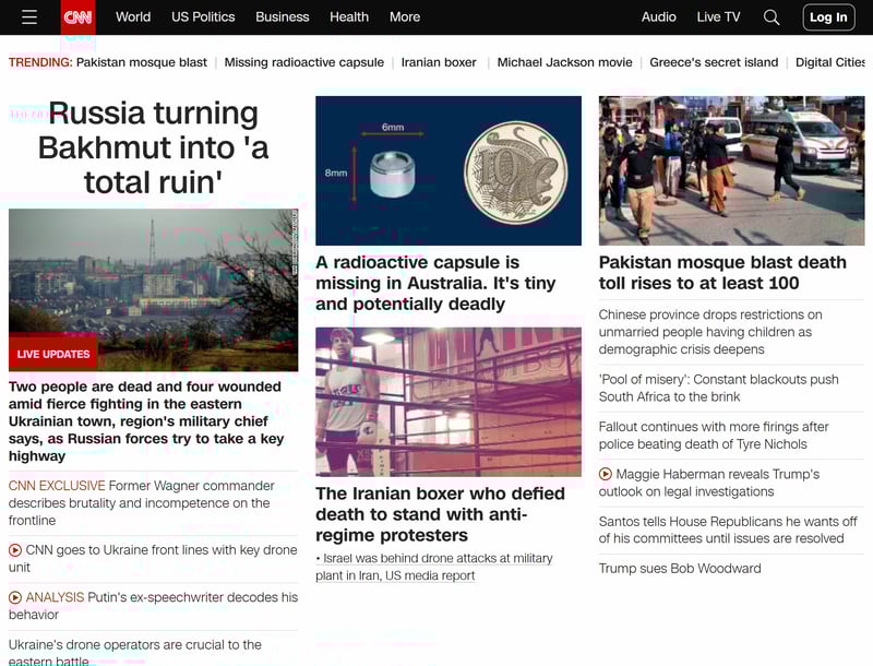
Red signals urgency - News networks like CNN use it not only in their logos but also, to highlight breaking news (Source: CNN)
Green
Green stands for nature and wildlife. We also associate green with freshness, health, (financial) growth, poison, jealousy, and hope. Colors in this spectrum are often used for good news, organic products, and well-being.
Like dark blues, dark green tones impart an air of respectability and seriousness. Words that typically conjure up green tones include leaf, mint, pine, emerald, and jade.
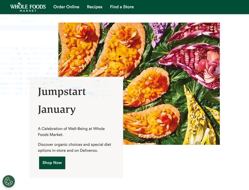
Green represents nature, health, and wildlife (Source: Whole Foods).
Yellow
Yellow is the brightest primary color. It's typically associated with summer, sun, friendliness, and excitement, as well as cowardice, stinginess, and egotism. Like red, it also is used to warn and indicate danger, often in combination with black. Whenever you hear blond, corn, lemon, taxi, or sunflower, you'll likely picture a yellow tone.
Blue
Blue is a colder color than the three we've listed above. The sky, water, technology, freshness, virtue, rationality, and calm are often associated with blue. It's little surprise therefore that the color frequently appears in the corporate colors of technology companies, legal practices, and banks, as well as uniforms.
When working with blue tones, keep in mind that very light or bright shades are seen as feminine, with darker ones perceived as masculine. Well-known blues include azur (lapis lazuli), baby blue, turquoise, Prussian blue, and indigo blue.

Intel, HP, Facebook, Twitter, Skype, Samsung, IBM: Many tech businesses use blue in their corporate branding (Source: intel.com).
Orange
Most people associate orange with friendliness and high visibility. Fruit, energy, exuberance, fun, sweetness, and autumn are just some of the things that orange is used to represent. The color often highlights certain aspects in ads or, in combination with earthy brown tones, clothing, or interior design elements.
Not many words conjure up orange hues, but some notable examples include cheese, apricot, peach, and clementine.
Violet
Like orange, violet (or purple) plays a secondary role in our daily lives. Typical associations include religion, feminism, fantasy, esoterics, pride, and sin. Traditionally, purple is an indicator of high status and aristocracy (at his coronation, King Charles III wore violet and crimson robes). Violet is used sparingly in advertising and marketing, apart from Milka. Lavender, lilac, and plum are some common "purple" words.
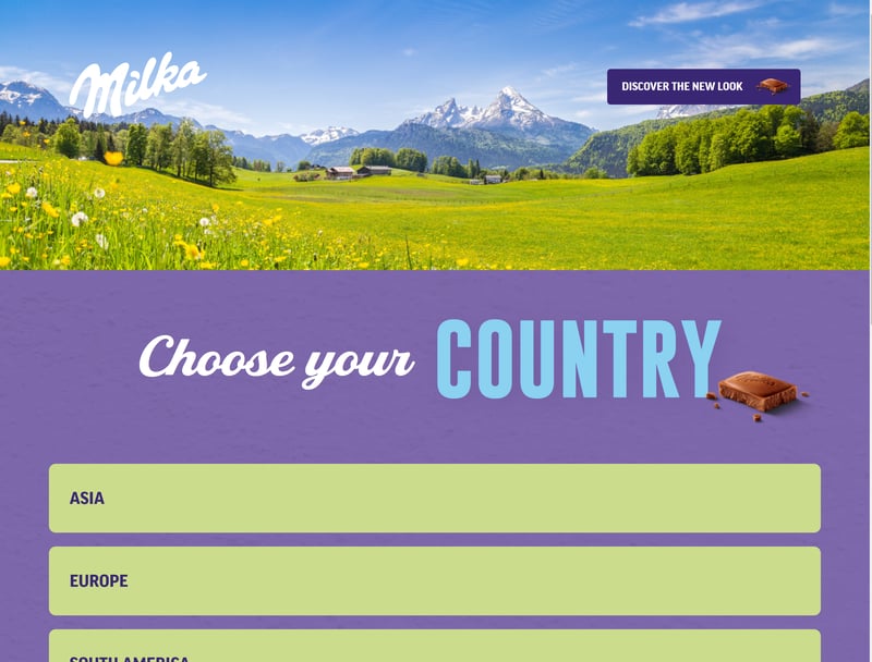
Milka trademarked the distinct shade of violet (lilac) its packaging uses (Source: milka.com)
Pink
Pink (rose) is often seen as a "girly" color. Technically speaking, Magenta (T-Mobile's logo) is also a shade of pink, but most would likely perceive it as closer to red.
Whatever the case, pink is not broadly used in advertising and marketing. Notable exceptions include Victoria's Secret or businesses associated with weddings. Both colors are associated with femininity, romance, and childishness. Flamingos, roses, coral, and salmon should conjure up hues of pink.
Brown
Like green, brown is associated with nature. We think of earth, soil, forests, and being outdoors. It's not surprising, therefore, that companies specializing in camping and hiking products often use brown tones.
Brown is also popular among bakeries, coffeehouses, and chocolatiers. Frequently, brown and gold are used by luxury businesses. Comfort, warmth, and natural materials are associated with brown.
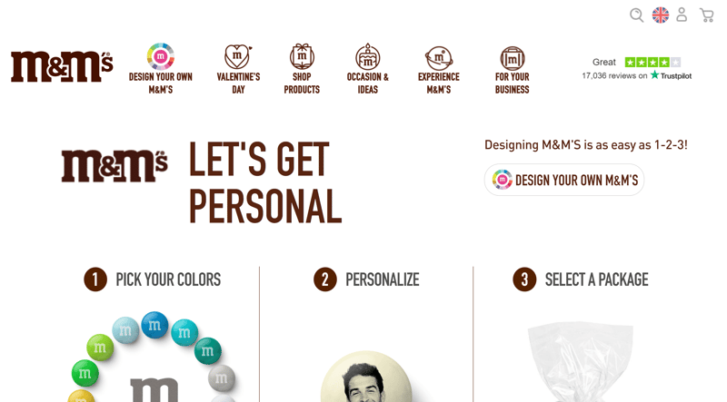
Many consumers associate brown with chocolate (Source: mms.com)
Color Trends by Decade
A brief look at color trends of the past few decades demonstrates particularly well how different colors work with one another. Orange is part of the 70s, whereas the 80s were all about neon and later, pastel colors. When working with color schemes in corporate branding, reviewing past trends can often provide a great deal of creative inspiration and help you fine-tune your palette to your target audience.
Corporate Branding: Only the Boss's Favorite Color?
If you're working on a business's visual identity, it's important to understand how colors interact and what sort of psychological impact they have. Colors can promote your business and ultimately, boost its success. They play a significant role in whether a design works: Determine what you want to achieve and test various combinations with (sample) target audiences. Pay attention to the atmosphere they create and their readability.
It isn't necessary or wise to select corporate colors based on what the founder or CEO wants - remember, colors have meanings and should be attuned to your business's overall concept and strategy, not at odds with it.
There are plenty of examples of powerful corporate color concepts. Starbucks, founded in 1971, wanted the green in its logo to "represent the positive way the brand treats its customers as well as its partners." Others, like T-Mobile, sought to make a statement through their use of pink and "firmly position themselves in information and telecommunication technology." In both cases, the companies have done extremely well.
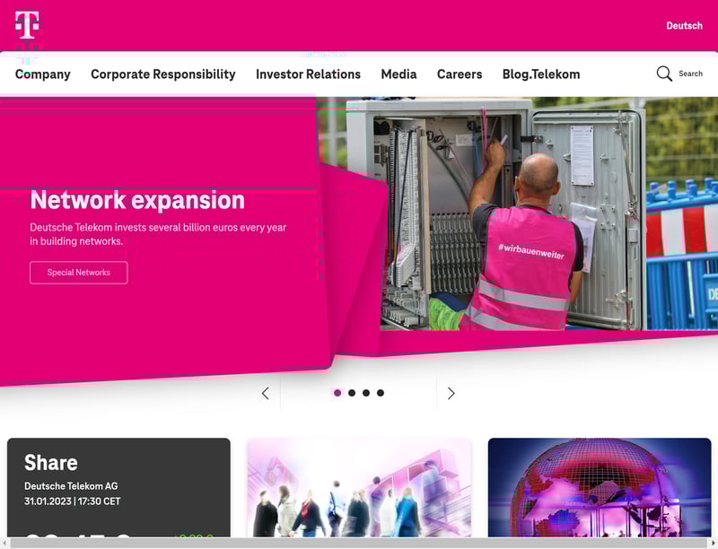
When you see magenta, you'll probably think of T-Mobile.
Integrating Color Meanings Into Digital Design
Turning back to the easier aspects of working with colors: Media intended for public consumption should always make strategic use of colors. In terms of digital design, products need to be useful while visually conforming to your company's design.
Colors can help to achieve both of these goals. You can direct users and structure content through colors. Color designs tailored to your target group can increase the amount of time they spend in your apps or on your website. Ultimately, the way that you use colors (in harmony with their meanings) can even help generate more business (conversion optimization).
Conclusion
Color is a powerful tool that businesses can and should use to their advantage. They can evoke a certain atmosphere or warn about a particular action. Designers who underestimate the persuasive power of color do so at their own peril.
However, just because there exist certain rules and associations that we've briefly reviewed in this article, interpreting colors remains subjective. For that reason, don't be disappointed if the hues you've carefully researched and selected don't immediately work with your target group. You can refine your results and find the best color tone for an element or design through A/B testing.
To learn more about colors, you can explore the differences between RGB and CMYK. If you're not a professional designer, but would still like to select colors for your media (illustrations, posters, or online ads), the templates and color palettes offered by online design tools like Canva can come in handy.