Whether fashion, cars, or websites, design is design and trends change from year to year and with each new development. While the catwalks in Paris and Milan set benchmarks for the newest materials, cuts, and accessories, for digital designers, it's all about elements, technology, and usability.
Even though trends are notoriously fickle and hard to keep up with, it's a good idea to at least be familiar with what is and is not in vogue. This is particularly true if you're considering creating your own website since one or more of 2022's Top 12 web design trends might be just what you're looking for.

Trend: The More Color, the Better
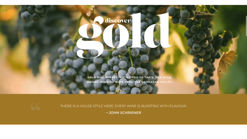
The era of muted colors is over. More and more web designers are tapping into the striking color combinations characteristic of the 1980s. Earthen tones alongside powerful pastels accented with screaming neon flourishes derived from chaotic patterns and odd shapes are all the rage. Another hallmark of this style is geometric elements comprised, in part, of squiggly lines.
Colorful, uneven, and chaotic: Retro unconventionality in both shape and color choice is one of 2022's biggest web design trends.
If that's a bit too radical for you, try incorporating high contrast and lively color gradients where possible, since these blasts from the past are also considered stylish. Regardless of which colors you select, dynamic accents help create a highly unique and memorable web atmosphere. Should you want to see how such a gradient looks with your company's colors, you can head over to Mycolorspace and test out different variants and generate the necessary CSS code for integrating them. Alternatively, you can allow yourself to be inspired by Grabient.
Blasts from the past: High contrast color gradients set the right accents in 2022.
Creative Courage
One reason for the pivot towards more unusual color and shape selections can be found in the minimalist style which continues to characterize plenty of websites. While clear and tidy, precious little separates these pages from one another, making it necessary to set greater accents and break out of the figurative mold to achieve recognition. Adventurous color palettes, smooth gradients, and the non-conventionality which was the calling card of the Memphis Design movement of the late 1980s are the end result. Unlikely effects and selections have wound up setting new design standards.
Trend: Powerful Typography
A picture might be worth a thousand words, but the second major web design trend of 2022 says otherwise. Short, to the point, and ideally, oversized - that's how text should be used in the present. Bold typography helps transmit clever marketing messages and slogans, while also making navigation menus pop.
Words instead of pictures: Large font is in, and in the example above, is used to detail a navigation menu.
These days, you can't go wrong with expressive fonts and retro curves. With them you'll be able to bring your message across to visitors and clients, underline key ideas, or even entice viewers to focus on a specific action.
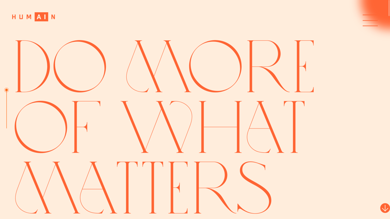
Present your message effectively and boldly with oversized text.
Trend: Mobile & User First
Okay, perhaps this trend isn't 'new', but mobile first is more important than ever. We've also grouped it together with the equally essential, user first.
You only need to look at the proliferation of different mobile end devices to see why the former made it onto our list. At the same time, since technology plays such a significant role in our lives, user-friendliness is just as critical. After all, the average user decides whether or not they like a website in 50 milliseconds, giving you that much time to impress your digital visitors and let them know you have what they need.
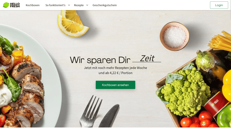
Clear, to the point, and neat: At first glance, users will be able to tell what the above website, Hellofresh, is all about. You're also just a click away from placing an order.
But how can you impress users? A good place to start is by presenting the information they want in a clear and prominent fashion, or, by making it easy to find. In such cases, design is about more than just window dressing. To achieve this, you'll need to know why people are visiting your site and what they intend to do there. Paying attention to which devices they're on can help provide answers to these questions and more. Those surfing the web from a PC are usually after more detailed information than those on the go.
Trend: Interactive and 3-D
Interactive 3-D elements are all about joining in, rather than just looking at a static object. Such an approach can be particularly beneficial with high-quality products. Users can scroll over or click on pictures, change their vantage point, and zoom in and out, allowing them to comprehend an item much better.
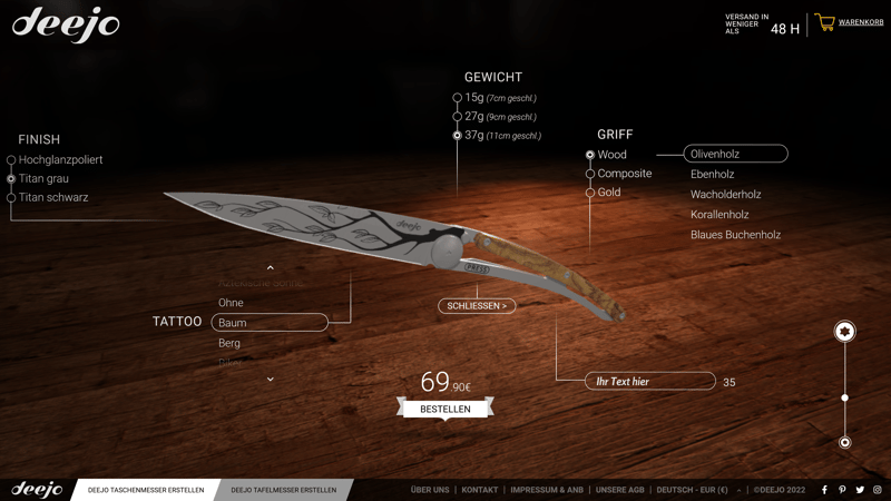
Knives from Deejo can be rotated and turned digitally, making it possible for users to truly design a custom blade and gain a clear idea of how they will look.
For those unable to make use of a three-dimensional model of their product, there are so-called micro-interactions. As Leonardo da Vinci is apocryphally purported to have said "simplicity is the ultimate sophistication."
And such simplicity can help to really set you and your products apart from those of your competitors. Flourishes to consider include a small progress bar, showing how much of an article has been read. Or sending feedback by clicking on an emoji. Even an animation detailing a download's progress, or a mouse arrow that changes into a continue reading one near the end of a page or text, are micro-interactions that add life to any website.
Trend: Neumorphism
This trend is also all about three-dimensionality. Neumorphism sounds complicated but is actually a fancy way of indicating greater depth and realism in web design. By using the same colors as the background, interactive elements appear deeper and more spacious through the intelligent application of highlights and shadows This has the effect of making objects appear to jump off the screen, setting stylish accents, and giving your website an air of elegance.
There is a disadvantage though: Visitors might be unable to locate important buttons or icons owing to the melange of colors. For that reason, if interested in this trend, we recommend using strong contrasts or subtle differences in color.
webflow.io shows how neumorphism can be utilized.
Trend: Serifs in Headings
In the past, there was a simple rule: Don't use serif fonts online. This is because letters written in a serif font have small 'feet' and slashes, from which they derive their name. While okay to read on paper, they were considered difficult and annoying in the digital domain. The only exception to this was for brief titles or headlines. Fonts such as Garamond or Bodoni are highly decorative in these contexts, making them ideal for setting charming accents.
Serif fonts set decorative and elegant accents when used in titles or headers. For body text, however, they can be difficult to read.
Trend: Visible Borders
Websites follow clear structures, but you'll typically notice only when they don't and instead appear disorganized, overfilled, and/or dissonant. The 'right' structure is based on a rather strict template that designers in 2022 can happily accentuate with borders and lines. This imparts layouts with a greater sense of realism and even a slight retro flair. Everything has its place and the visual layout leaves no room for doubt about where this is. Such layouts share some commonalities with so-called box designs, although they are more static and less flexible.
The clear division of sections is underlined by the use of borders and guidelines.
Trend: Scrolling Effects
Even though they aren't cutting-edge, scrolling effects in 2022 have come to see widespread use and are capable of positively surprising visitors to a website. One of the most popular of these is the parallax effect, which moves the foreground and background at different speeds.
Other effects playfully guide virtual visitors around your website. If you'd like to see how such an animation works in reality, you can in the Animate On Scroll Library. Your screen will come to life, making scrolling on any website a real treat.
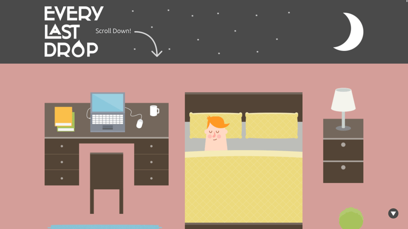
On Every Last Drop, visitors are gently told to scroll in order to interact with the website. By moving the mousewheel, the sun comes up and an informative story about water usage is presented.
When using such elements, it's important to maintain a balance between entertaining the user and not overwhelming them or distracting attention away from your content. For that reason, we advise you to check that the animation complements and emphasizes your content.
Trend: Minimalism
Less is more. In place of opulence and grandeur comes natural modesty, functionality, and unobtrusive design with lots of white space. Website visitors should concentrate fully on your content, without being distracted by how it's designed. Although this stands in stark contrast to Trend #1 on this list, which advocates more color and liveliness, minimalism remains highly popular and prevalent.
Done right, less can really appear to be more, such as an image with a pointed headline, clear menu structure, and featuring soft color tones. Or maybe just present your logo against an off-white background. The less that's visible in the front end, the sleeker and more streamlined a website will look on the data level, which has the added benefit of improving loading times.
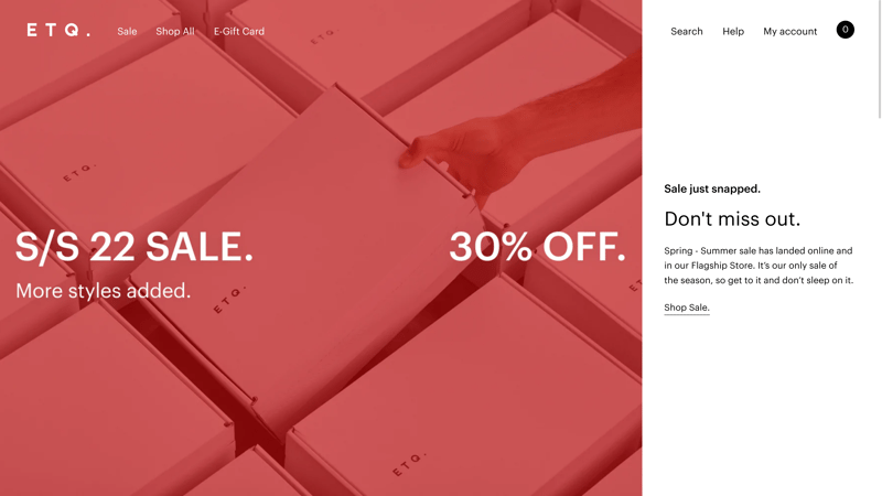
ETQ showcases its shoes in a clear and no frills catalog style, which perfectly typifies minimalism.
Here too, it's important to remember that colors can guide users through a website and that elements are easily remembered and used as frames of reference. Should your website be too minimalistic, a user might get lost, be unable to find what they're looking for, and/or become bored. To avoid this, it can be helpful to combine multiple trends to take virtual visitors on a guided tour through your portfolio or catalog.
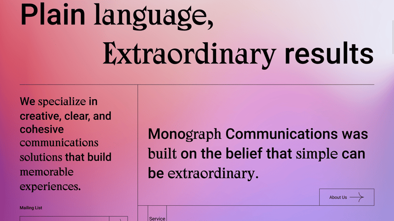
Monograph, a specialist in communications, combined several of 2022's website trends: Color transitions, visible borders, minimalism, and micro-interactions are all visible above.
Trend: Dark Mode
While it's true that in design white creates the impression of more space and has plenty of sensible uses, there are times when it can be disadvantageous. Just ask anyone who spends considerable amounts of time reading text on a computer, where the standard is dark text against white backgrounds. For that reason, more and more text-centric sites are offering alternative color schemes that put white text against dark backgrounds - otherwise known as dark mode. This doesn't only save your visitor's eyesight, but it also sets your page apart from those of your peers.
Dark mode is available in most web browsers and apps and can be easily activated by heading over to settings. Another benefit of dark mode with OLED is that it can save up to 30% more energy.
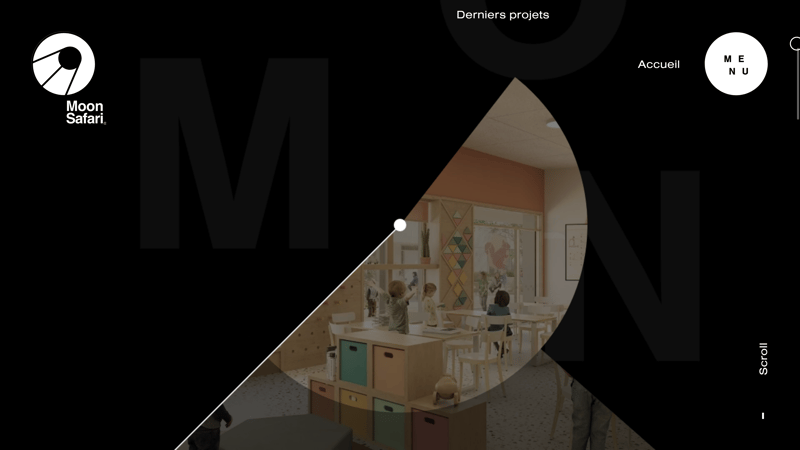
Moon Safari, an architecture office, utilizes shadow effects in its dark mode, creating a suspenseful and adventurous atmosphere.
All the same, going over to the dark side isn't without drawbacks. Should a website be particularly colorful, implementing dark mode without a switch isn't easy. You'll either need to create two variants or overhaul your existing color concept and style guide, replacing it with one that's dark mode compatible.
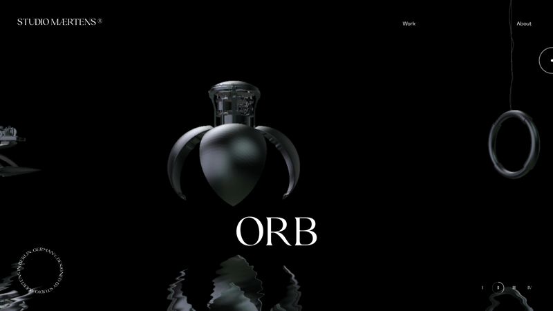
Some websites, such as that of the industrial designer, Maertens, only have dark mode.
Trend: Asymmetric Layouts
More so than usual, this trend is a matter of personal taste.
Usually, website layouts follow a clear formula, relying on symmetry and structure. The resulting balance creates a sense of harmony, wellness, and familiarity. Asymmetric design, on the other hand, can seem confusing and chaotic, but in 2022, this can be done on purpose.
As alluded to above, this isn't ideal for every customer but can be an interesting option to explore, since it allows you to present special products in a unique light. However, more than ever, if you've decided to work with an asymmetric design, you'll need to be absolutely certain that the rest of your design elements are balanced. Otherwise, organized chaos will quickly collapse into disharmony.
Trend: Glassmorphism
If glassmorphism doesn't sound particularly new to you, it's because it isn't! In its newest iteration, glassmorphism now indicates high transparency and slight shadows, endowing digital objects with a 3-D effect that looks like glass. Apple and Microsoft adopted this style some time ago, but it really only came into its own in 2022.
To appear as realistic as possible, you'll need to start with a clear color gradient for the background. At the moment, users gravitate towards powerful tones. And glassmorphism is great in combination with our Trend #10, dark mode.
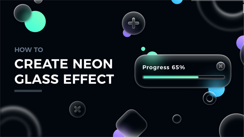
Glass effects look great in dark mode, so long as they aren't overdone.
In case you'd like to give glass effects a go and generate the requisite CSS code, you can with Hype4.academy's glassmorphism CSS generator.
Conclusion
Web design trends share a lot with those in fashion, architecture, or furniture: Plenty of things have been done, some have been developed further, and little is entirely new. All the same, the Internet is getting more and more creative. Don't expect all 12 of our above trends to make it into 2023 or beyond, however, all indications point to designers moving away from rigid structures towards more liveliness. Usability and loading time will remain key, however.
Determining which of our Top 12 web design trends of 2022 are right for you depends largely on your product, your clientele, and your target group. Web designers need to be able to set the right accents and convert raw content into a form that will encourage its consumption. As such, trends should just be the starting point or source of inspiration for whatever it is you plan to do since the end result should be as unique and reflective of you as possible.